Ndustry [Ndústria]
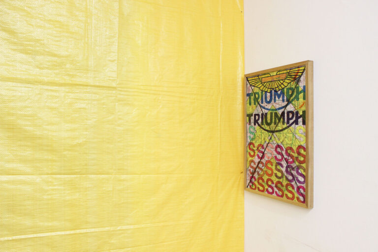
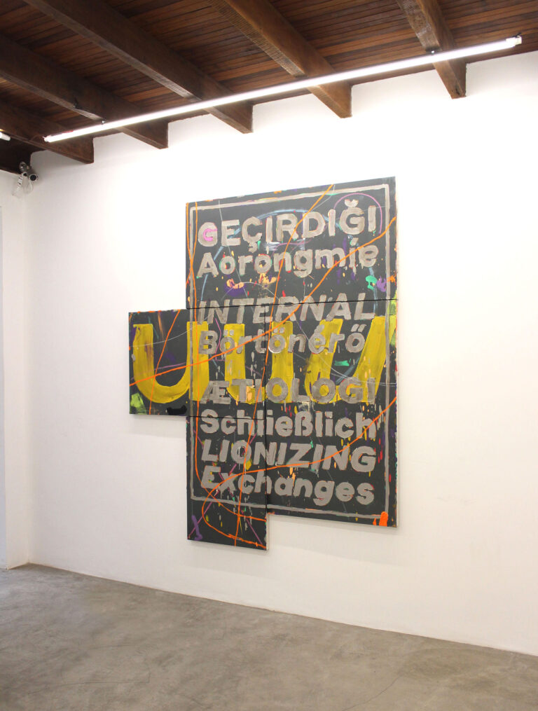
The curator of the Ndústria exhibition, Eduarda Freire, drew attention to a fundamental detail of the work 0o (2016), which she and Guilherme Callegari chose to present right at the entrance of the artist’s solo exhibition at Verve: the zero and the letter “o” represented in the vertical diptych are aligned to the left. “It’s as if he’s typed the symbols on the screen,” he noted.
A “diagrammed” painting may seem something contrary to the tradition of language, but it is enough to remember Christopher Wool, Mel Bochner, Richard Prince, Frances Stark or Jenny Holzer, to stay in the most recent examples of the practice, to reconsider the initial strangeness that the idea suggests.
Diagramming in the history of art has as many precedents as offset plates incorporated into works of art, as is the case of series by Antonio Manuel, Robert Rauschenberg and other artists who appropriated printing plates for use in the graphic industry or in lithographic printing for industrial purposes (packaging, logos, etc.).
Are we talking pop art? Yes and no. Andy Warhol does not appear in Guilherme Callegari’s references. More appropriate would be to think of the avant-pop Haim Steinbach or Ashley Bickerton, that is, the generation of artists already disenchanted with the promises of large-scale industrial production. The disenchantment of the 1980s has two central reasons: technological advances did not reduce social disparities nor, from the point of view of art, provide the 15 minutes of fame advocated by Warhol.
Nor did they democratize the humanistic access of all to the condition of artist. On the contrary, the end of the 20th century witnessed the universal precariousness of work, social rights and the elitization of art to parameters of inaccessibility unprecedented in the modern era: we went from “anyone can be an artist” to “a chosen few will be accepted in the pantheon of the market” in a few decades.
Disenchantment led to cynicism (read “postmodernism”). And cynicism was transmuted into activism (read “collectives, relational art, etc.”). Which brings us to the second decade of the 21st century, marked by a kind of general aesthetic reformatting, which gave way to a generation that observes the entire history quickly listed here with enough distance to not need to respond to it. Its relationship with history “after the end of art” is an oxygenated bond, and this “post-end generation” made possible, consequently, an art that could only be invented by those who did not live the end and that, therefore, did not sees condemned to the tautology of approaching it until the end of days.
The final point theorized by Arthur Danto (which refers not to some kind of apocalyptic extinction, but rather to the end of a certain narrative about art) – and, before him, by Lyotard, Baudrillard, Jameson and co, led to the volatile art we witness in awe today. Made by the generation that turned art history into a database liable to be misappropriated without guilt, that rediscovered the pleasure of painting (whatever it wants, post-dichotomies abstraction x figuration, brushstroke x line, etc.), which makes use of cutting-edge technology without having on the horizon the outdated categories of “technological art”, “web art”, or “digital art”. In fact, for this class, the world is digital.
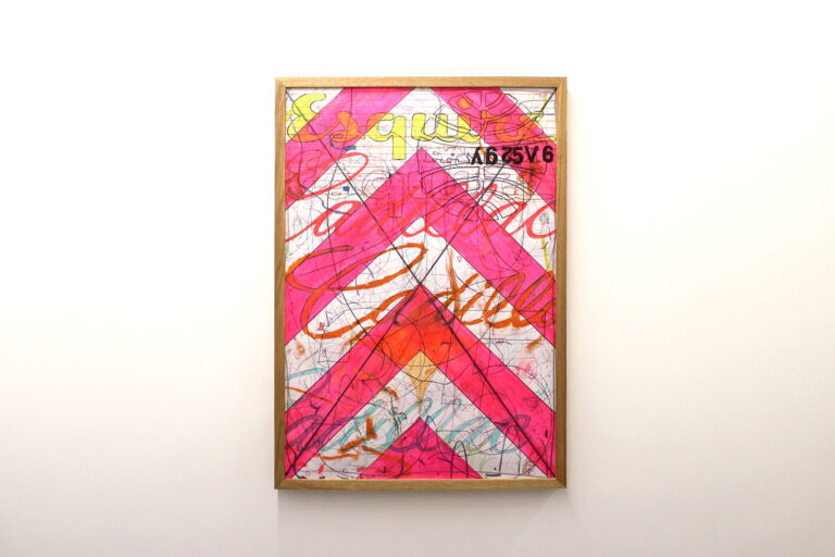
A possible reading of Guilherme Callegari’s recent work involves the supposed symbolism in the use of rare car logos, powerful multinationals and elitist journalistic publications to criticize the world of luxury consumption. The multiplication and overlapping of logos and their eventual subversion could be interpreted as emblematic of a disenchanted, cynical and/or activist artistic posture. All at the same time, a pre-end art history critic would say. However, as a member of the post-end generation, wouldn’t it be appropriate to ask if there are other logic(s) behind the artist’s decision to feature logos in his paintings?
He says that he always liked “this car thing”, that since he was little he consumed information about it, watched the models of cars on the street, copied the stylized symbols of favorite brands, that is, “this thing” aesthetic, cultural thing, generational thing feeds Callegari’s imagination since forever, since before repertoires on pop art or Christopher Wool came to populate his imagination. It is worth mentioning that, before art, came the repertoire of graphic design. Guilherme has a degree in design with an emphasis on typography.
It matters little, moreover, what came before or after. The post-end generation has further discarded this modern dichotomy. It is important to know that, as an artist, already investigating pictorial language, experimenting from the point of view (or place of speech, to use the expression of the current cultural narrative) of his generation, it happened that, at a given moment of the research, around 2014, he realized that the abstract canvases he had been working on needed a new element that would organically integrate with them. That’s where the car logos appear. “It was something from my repertoire, what stimulates my gaze when I walk down the street,” he says.
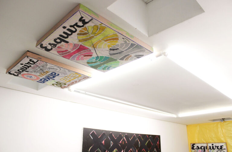
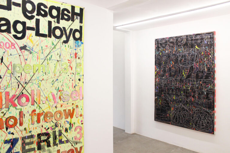
From these first insertions, when the artist and the designer reconnect, Guilherme moves on to paintings with illegible writing, which unfold into new paintings, in which he gives greater prominence to typography. In these works, there is no longer anything properly written: they contain typographic stains as well as fields of color. They are paintings, not texts, they are a pictorial delight made of colors and letters. To paint a typographic stain is to emphasize the layout at the expense of informative content. By defunctionalizing the verbal language, the artist aestheticizes the designer’s art: the lines, the voids, the thickness, the depth, the blocks of color, the graphic stains. Are we talking about color-field painting amalgamated with graphics? Of an unusual meeting between Frank Stella and Cy Twombly? Yes and no.
The context here does not invite speaking of “or”. Stella and Twombly, Jasper Johns and Willem de Kooning, and Laura Owens, and Wade Guyton, and Dan Colen, and Ana Prata and Rafael Alonso and a whole lineage of artists who paint what they want and how they want, and precisely in this lies their rupture. Volatile generation. volatile art. Deal with it! Otherwise, how to explain, for example, the series Ferragens/Desmedir (2016)?
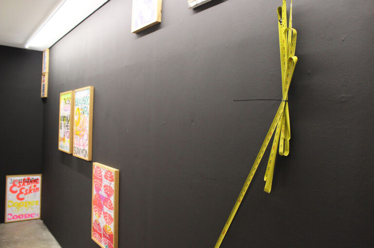
In this series, the presence of Twombly, an assumed reference to Guilherme, is more marked. The artist thinks of these objects as drawings. He says that they emerged, like the logos, from an observation and decantation of a long time: three years ago, a broken measuring tape that he folded and separated to throw away caught the artist’s eye due to the clumsy scrawl on the pile of garbage. From there, the metal object was rescued and placed on the wall of the studio, where it remained for years.
For Ndústria [Ndustry], it made sense for the three-dimensional drawings to be presented with the paintings and papers. Do they differ from the set? In fact, they clash in the exact proportion that dripping, material painting, flat graphics, carefully constructed typography and ballpoint pen scribbling all coexist on the same surface in some of the works. From a certain point of view, they are as coherent as everything around them.
With a finely diagrammed curatorship (Eduarda Freire also has a degree in design and is also an artist and, equally, connected the two ends of her young trajectory very well), the exhibition at Verve has layers and more layers to be explored by the look and the thought. I would like to draw attention to just one more disturbing aspect of this collection of works gathered in this magnetized space with good vibes (congratulations to Ian and Allann for the feat!).
Returning to my post-pre-final habit, I find myself evoking Cildo Meireles and Jac Leirner in front of Guilherme’s works. Both for the plasticity they give to everyday materials and for the defunctionalization of these elements. With Leirner, Callegari maintains yet another proximity, that of an archaeological futurology. With the transformations of the car culture, autonomous cars on the horizon, possibly the art public of a decade or two ahead will look at the artist’s paintings as we do today with the works that Jac made, in the 1980s and 1990s, with plastic bags. of the period’s brands or with stickers that we of the X generation used to stick on the window of our bedroom when we were teenagers.
Time has been adding this layer of additional meaning to works that convey symbols of consumer culture (since pop art, one might say): art becomes an archeology of the cultural habits of remote times. At an unprecedented speed. Today’s logo belongs to the ethnographic museum of tomorrow. But there is also another important inflection: what is the relationship between millennial artists and time? The past is your database. The future? This one will be, at the very least, better diagrammed.