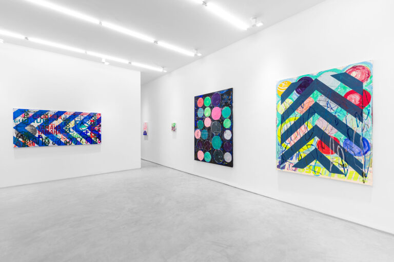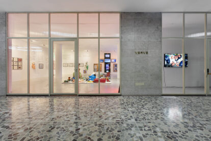
Paintings [Pinturas]
There used to be nature, remember? We dreamed of her, imagined going to her, with eyes moist and bright with hope, as if wanting to bathe in the river of oblivion in order to start again. Some of us, among them many young people, have taken seriously their intention to escape from urban life, but the aerial waterways coming from the Amazon are slowly but inexorably becoming scarce, the Pantanal burns, the inns on the most remote beaches are chosen according to photos posted on Instagram, and there are those who console themselves by watching Naked and Afraid on the Discovery Channel (and see what gave the famous impetus of the discovery that led Fernão de Magalhães to circumnavigate the globe), concluding that in the face of what might be nature, the safest thing is to stay in the living room at home, it’s definitely not worth putting up with all that suffering even if it’s to earn a fortune. When did all this start? Hard to know, even more so to know when and how this will end. Guilherme Callegari has good conjectures about this, strong and convincing questions.
Graduated in Graphic Design with a specialization in Typography, trained in thinking and producing letters, the visible grain of language, Guilherme got used to theories and practices aimed at reducing the world to visual signs. I hasten to add “visuals” so as not to incur an obviousness, because as the poet Octavio Paz warned, everything is a sign, and the word is the most radical sign. (Strictly speaking, he speaks of metaphor, which, for what interests us, amounts to the same thing). English Pops, before the North Americans, were the first to be fascinated by North American posters and advertisements. Architects Alison and Peter Smithson collected them. The artists Eduardo Paolozzi, Richard Hamilton, Peter Blake, David Hockney were unanimous about their plastic superiority in relation to references from the History of Art, a respectable, outdated and inoperative discipline. With the endorsement of these artists and the North Americans Jasper Johns, Roy Lichtenstein and Andy Warhol, whose works, as happened with their British colleagues, accused the impact of the propaganda, the designers of all kinds, especially the graphics, the semi-gods of advertising, they became not the spokespersons, that would be little, but, making use of a very old word that has recently come into fashion, the avatars of a new era.
European and North American imagery, starting in the 1950s and peaking in the 1960s, proclaimed that the world was boring, monotonous, gray and old, and was replaced by charismatic, humorous images, based on popular icons and products; ironic, sensual, sweeping, seductive images, treated with vibrant, brilliant colors. There was no way to resist them.
The logic of programmed obsolescence imposed by mass consumption has, since then, forced the redesign of products every year; formal novelty, even if restricted to one or another detail, to the packaging label, was seen as an essential strategy. The problem with this bet on appearance was that the product lost its audience, either because it did not recognize it or because its new appearance did not appeal to him as much as the previous year’s version. It was there that the brand, the logo, the typographic fonts and the chromatic treatments gained a more and more relevant role. It was there that the world experienced a radical and overwhelming Metominic reduction. More than the product what matters is the brand. And so began a fierce and permanent struggle between the most established brands, the so-called Top of mind.
Guilherme Callegari’s paintings and drawings deal with the virtual burial imposed on us by these marks. After decades on end hammering our retinas, disputing and confusing our imaginations, they were losing space, being abandoned, exchanged for others, or left aside due to the bankruptcy of the companies and products they represented. Before, the production of each brand required months of serious and methodical work, real fortunes were consumed in the elaboration of a clear brand, capable of meeting the laws of Gestalt, the science of good shape. Brands should be pregnant, it was said, should make a lasting impression on the distracted viewer, that is, any one of us, all of us, absorbed in our mechanical daily transits, sitting in front of the TV, manipulating the smartphone. What a beautiful Kodak lettering, amusing the little man with Michelin tires, how well resolved the Panam logo. By the way, where is Panama? What about Kodak? Both disappeared from the map but their echoes remain around the world, in reproductions of vintage advertisements, in period dramas and series or in films made at the time and that we still watch. They look like those photos placed in tombs that fade over time. The dead man, of course, is gone, and isn’t it an irony that his image lasts much longer than he does, refuses to die?
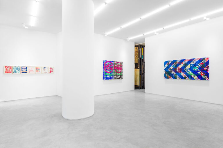
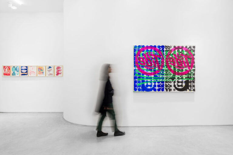
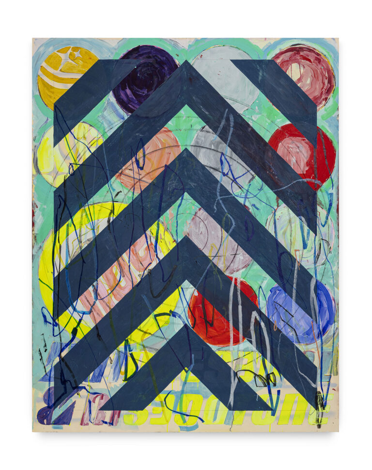
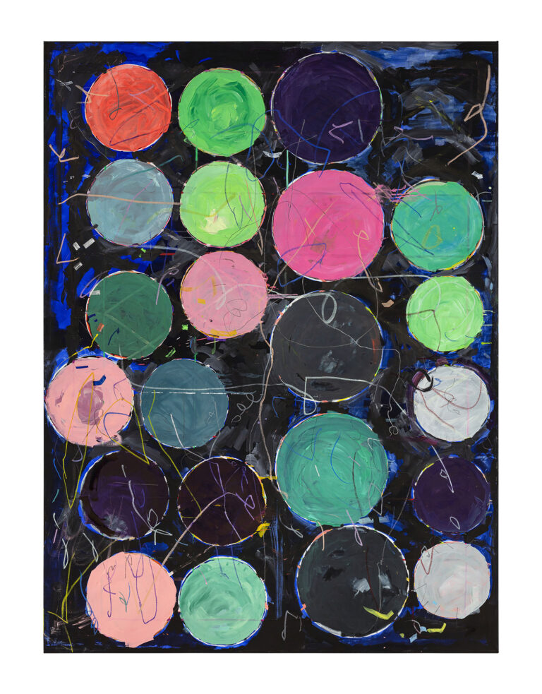
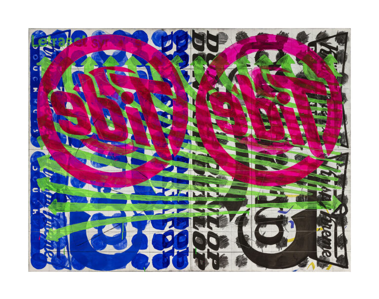
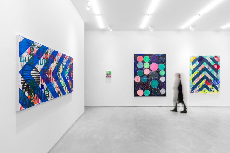
There is no longer room for the sharpness intended by the designers who used Helvetica, the most famous of typographic fonts, because we have reached a time when everything that was and has been produced so far competes for our attention at the same time, in a maddened cacophony. We recognize fragments of logos, letters, names and numerical sequences in Guilherme’s canvases, which brings them superimposed, mismatched, distributed in axes of divergent readings – inverted, diagonals upside down -, running over each other. If, on one hand, his training in Design led him to recognize the search for the typical legibility of the schools descended from Bauhaus and Ulm, here pursued by ESDI and FAUUSP, his contact with the graphic production of David Carlson, the great responsible for the alternative Californian magazine Ray Gun, the spokesperson for the 1990s, impacted him much, much more. That and, of course, the entry into the world of the arts, the systematic study of the paintings of Jaspers Johns and Cy Twombly, among many others.
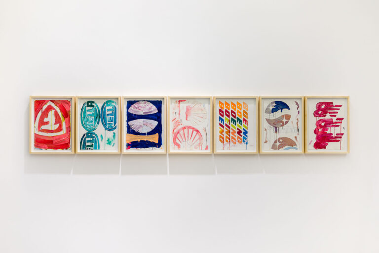
Guilherme Callegari’s poetics is calculatedly founded on noise, misunderstanding and deviation. It makes use of visual signs, each one with the vocation of a protagonist, such as the shield of Porche, Reebok, Camel, Shell, Pirelli, Oetker, GE, and brings them together, torn, poorly made, in arenas saturated with information, full of shapes, designs and colors. The artist reminds us that colors are signs, and that drawings are signs in a larval state, projects of future images carried out on reticulated papers, in fact, these are also signs of the design process, whoever designed it knows. Composing with this amalgam, making it even more complex, are the smudges, the dirt, the imprecision taken to the extreme, the whimsical, oscillating, sinuous scribbles, contrasting with the straight lines drawn with the support of rulers, proud as knife edges. The signs collide in chromatic atmospheres made with care, and the control of the chromatic variation of these canvases is remarkable, they are falling apart like the garbage dumps located on the outskirts of large cities, the sordid dumps, the acrid stench that comes from the remains of the unburied products that we once sought from the shelves, mesmerized by the way they vibrated.
At a time when most young artists bet on appeasing narratives, and it is surprising how romantically conservative canvases full of denunciations can be, Guilherme offers us a disturbing vision, a news of the mess we get ourselves into, us and our uncertainty about everything. Some canvases are even beautiful, it is true (the artist is not running away from beauty), beautiful as certain urban twilights are, spectacular effects that only concentrated winter pollution is capable of producing.